Figure-Ground
"Monogram" project represents a creative process of creating a logotype using figure-ground relationships. The idea behind the process is to find a perfect way to combine two letters which would harmoniously coexist in one form.
Branding, Advertising, Digital Art,
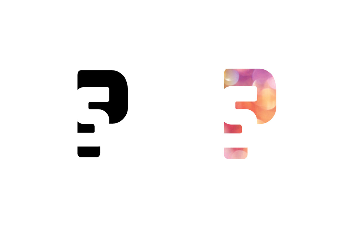
This project represents the design of two overlapping letterforms that naturally fit together to create a harmonious composition. The first step of the project was to experiment with different letterforms in order to find a perfect fit.
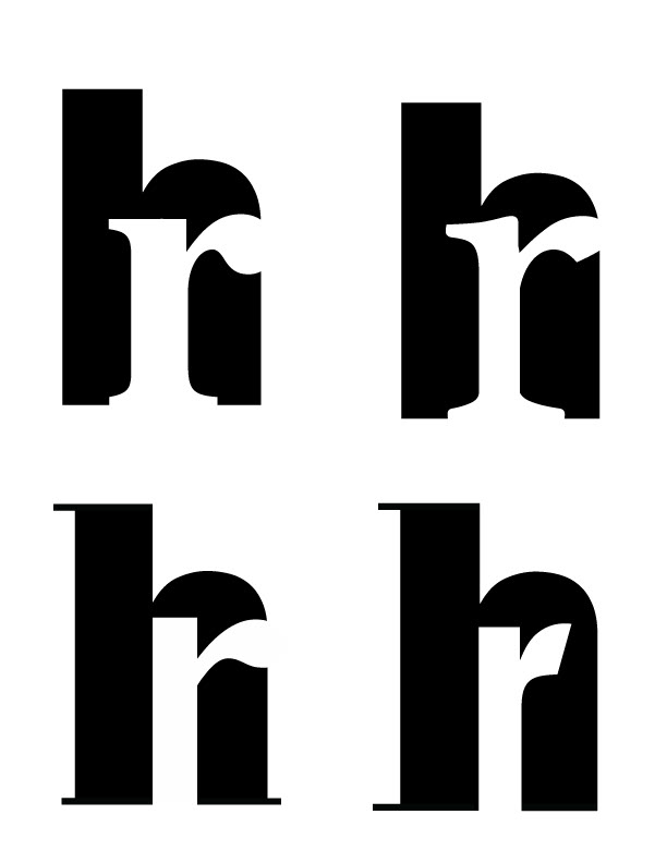
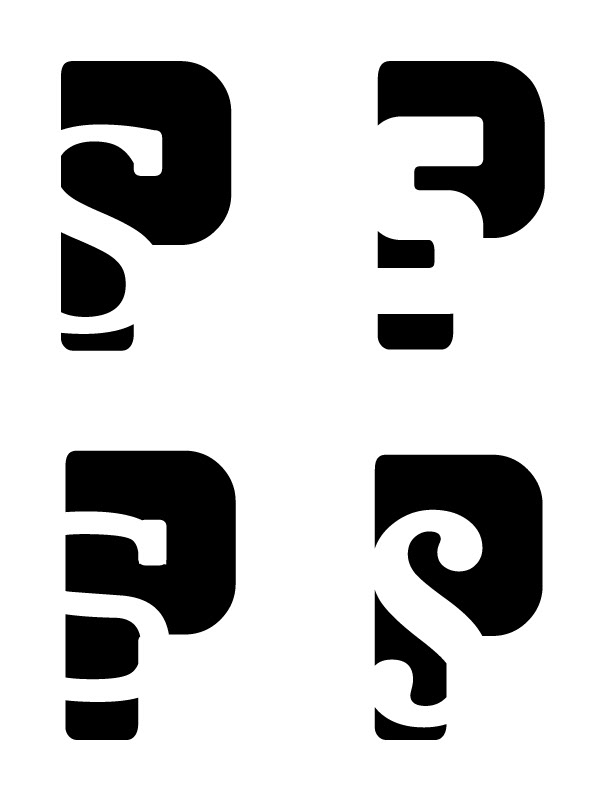
During the iteration process we were to pick the most successful monograms and concentrate on the details of the design, such as adjustment of the shapes of the letters, adding/removing serifs, or changing the width/height of the letterforms.
In the next step of the project we had to find the right pattern and color for our letterforms based on their shape.
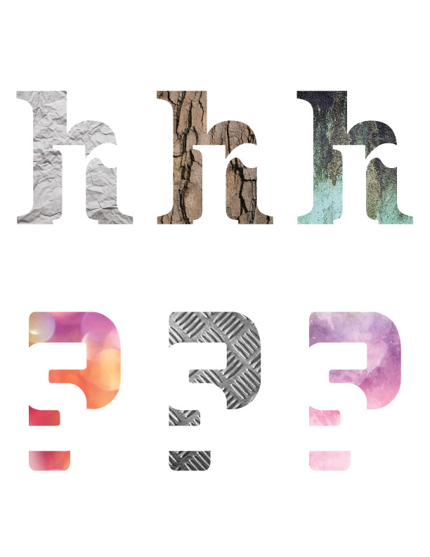
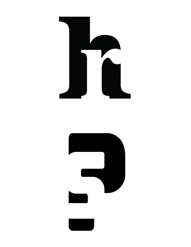
The next step was to pick the most successful color versions.

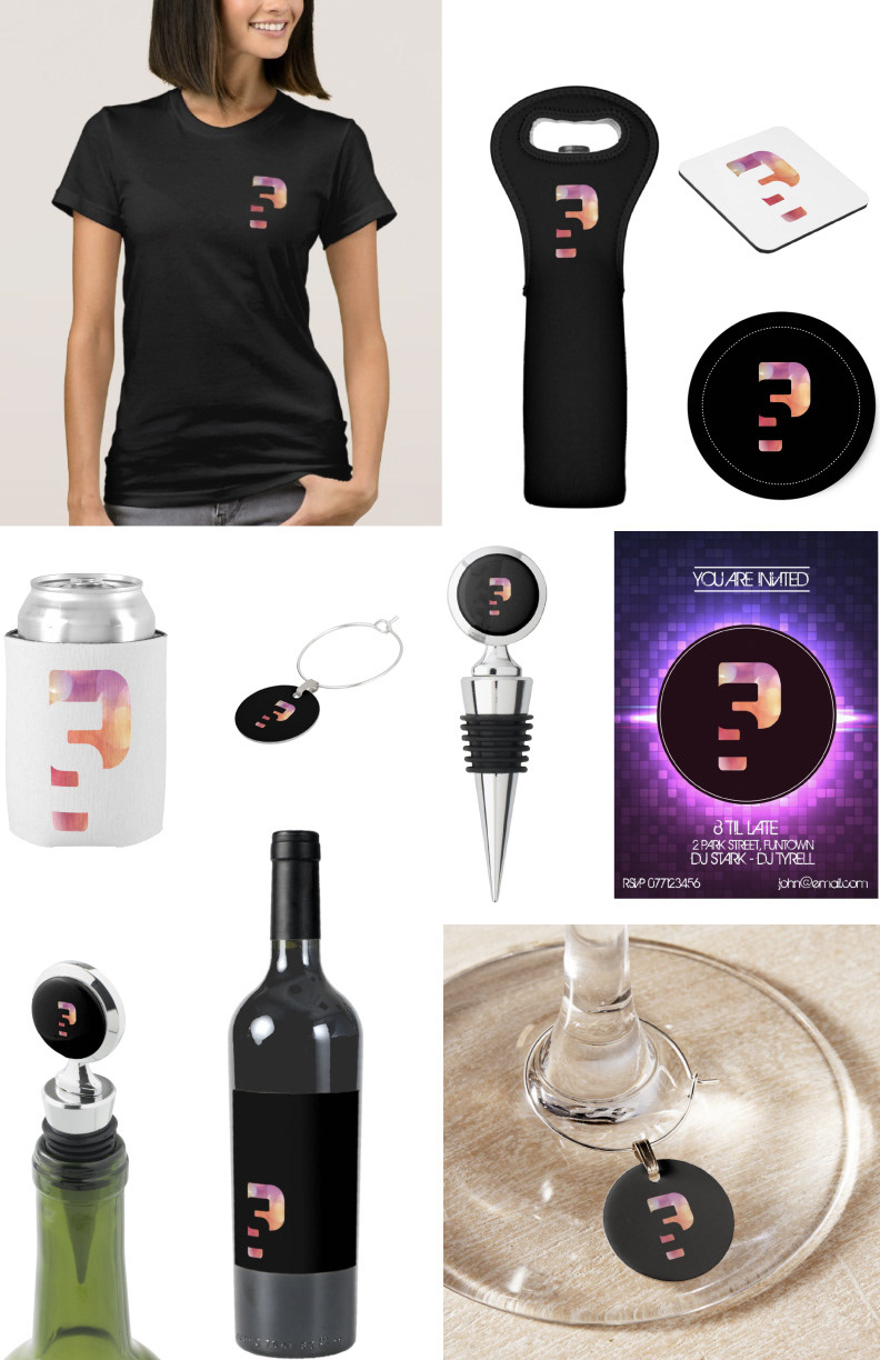
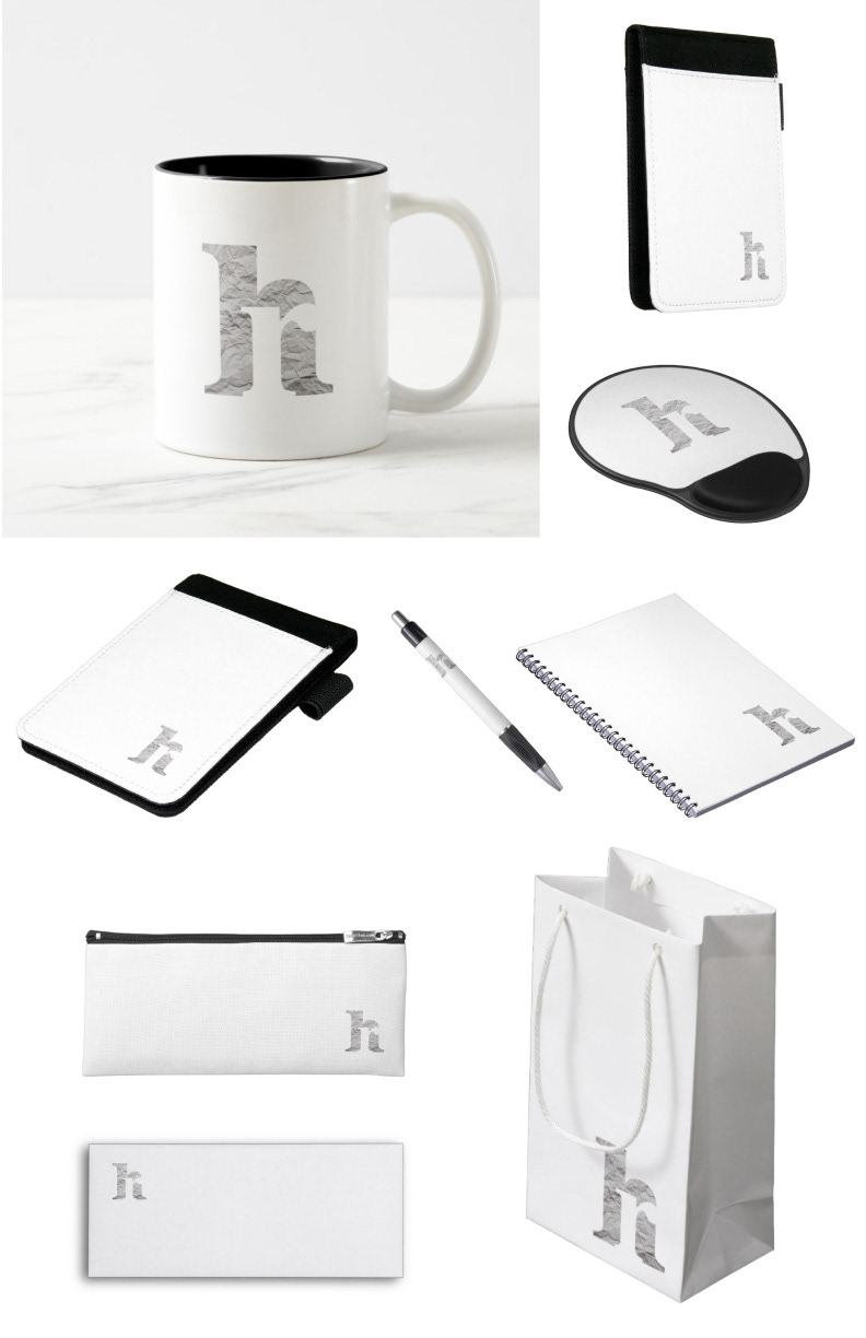
The final step was to apply the monogram to different objects that would give an idea to the viewer about the environment these monograms could live in. For example my "hr" pairing successfully exists in office environment.
The "ps" pairing, on the other hand, has more of a night club/bar feel to it. Below is the application of the "ps" monogram to different objects that might associate with night club-kind-of environment.